How Dutch Ink Advertising House developed a distinctive visual identity and product presentation for Pup Shake, a range of flavoured dog treats.
Creating a Brand That Stands Out in the Pet Care Market
The South African pet care industry presents exciting opportunities for brands that understand the relationship between product quality, packaging design and consumer appeal.
As pet owners become increasingly selective about the products they purchase, brands need more than attractive labels. They need a recognisable identity, clear product differentiation and packaging that communicates value at first glance.
For Pup Shake, Dutch Ink Advertising House explored this opportunity through a colourful, personality-driven approach to pet product branding, FMCG packaging design and creative advertising.
The result was a distinctive product presentation built around playful typography, flavour-led colour palettes, appealing product imagery and a memorable brand personality.
This case study demonstrates how effective packaging design can help transform an everyday pet product into a visually engaging consumer brand.

The Creative Challenge: Making Pet Treats Feel Exciting
Pet treats compete for attention in a crowded retail environment, alongside established food, grooming and wellness brands.
The challenge for Pup Shake was to develop a presentation that communicated the product range while making each flavour instantly recognisable.
The creative direction needed to achieve several objectives:
- Establish a consistent and memorable brand identity.
- Develop distinctive packaging for four individual flavours.
- Use colour strategically to differentiate products.
- Create a playful, approachable personality for pet owners.
- Produce visually engaging advertising suitable for digital marketing.
- Maintain consistency between product packaging and promotional material.
Rather than treating each flavour as a separate design exercise, the objective was to build a cohesive visual system capable of supporting the complete product range.
Brand Identity Development: Personality Meets Recognition
Successful FMCG branding begins with recognition.
Consumers should be able to identify a brand quickly, whether they encounter it on a retail shelf, through social media or in an online store.
For Pup Shake, the visual identity centres on an expressive wordmark, warm colours, playful typography and a friendly personality.
The brand presentation uses rounded lettering and bold contrast to create an approachable identity that feels energetic and memorable.
The supporting line, “Healthy Treats, Happier Tails!”, reinforces the brand’s pet-focused positioning.
Importantly, the identity was designed to work across multiple applications, including product labels, digital advertisements and promotional graphics.
This consistency is essential in FMCG brand development because every consumer interaction contributes to brand familiarity.

FMCG Packaging Design: Four Flavours, One Recognisable Brand
One of the most important considerations in multi-product packaging design is balancing individuality with consistency.
Each flavour must be distinguishable without losing its connection to the parent brand.
For Pup Shake, the packaging presentation features four variants.
Carob Truffle – Rich, Warm and Indulgent
The Carob Truffle design uses chocolate-inspired brown tones, rich textures and prominent flavour identification.
The visual treatment creates an indulgent appearance while retaining the product’s distinct carob positioning.
The label includes the message “Contains Zero Cocoa”, an important product distinction that should remain clear in consumer-facing communications.
French Strawberry – Bright, Playful and Energetic
French Strawberry introduces a vibrant pink colour palette supported by strawberry imagery and expressive splash effects.
The result is a visually energetic product presentation that creates immediate differentiation within the range.
The strong colour association also makes the flavour easier to recognise in advertising and product displays.
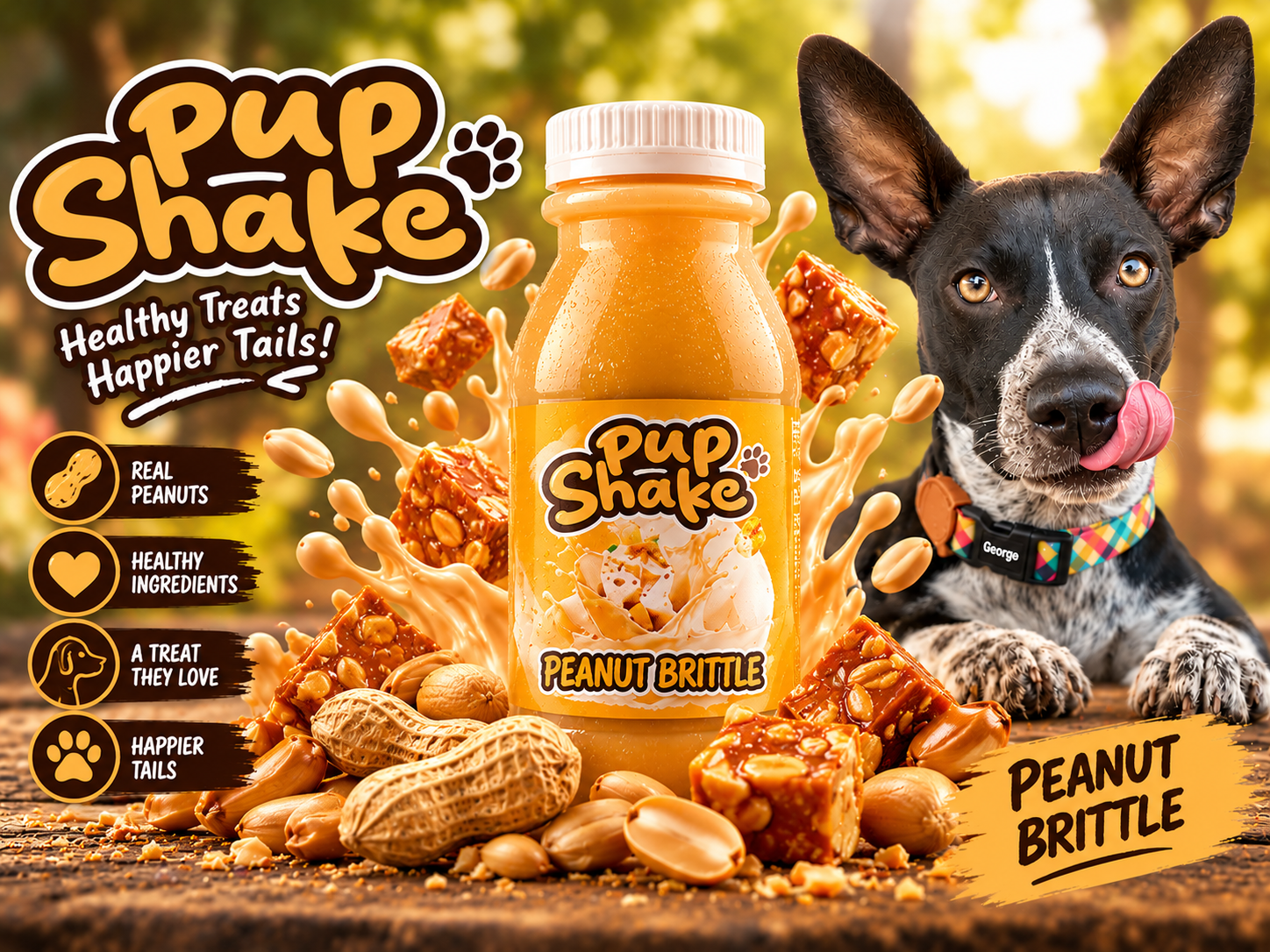
Peanut Brittle – Golden, Bold and Appetising
The Peanut Brittle variant uses warm golden-yellow tones, peanut imagery and rich visual textures.
The packaging combines an inviting colour palette with clear flavour identification, helping it maintain a distinctive position alongside the other products.
Toasted Marshmallow – Playful and Distinctive
The Toasted Marshmallow presentation uses purple branding, soft cream tones and toasted marshmallow imagery. The contrasting palette helps the product stand apart while maintaining the same brand structure, typography and packaging format.
Why Consistent Packaging Architecture Matters
Across the four variants, the same core visual elements establish a recognisable product family.
This approach offers several marketing advantages:
- Faster product recognition.
- Clearer flavour differentiation.
- Consistent branding across advertising platforms.
- A stronger collective presentation for the product range.
- Greater flexibility when introducing additional variants.
For FMCG brands, a scalable packaging system is a valuable foundation for future product development.
Creative Product Advertising: Bringing the Packaging to Life
Packaging is only one part of the consumer experience.
To support the Pup Shake product presentation, the creative direction extended into a series of flavour-specific advertising visuals. Each composition combines the product bottle with ingredients, expressive liquid effects and lifestyle-inspired imagery.
The purpose is to create an immediate visual connection between the packaging, flavour and overall brand personality.
Building a Recognisable Campaign Style
The advertising treatment follows a consistent visual formula:
Product hero: The bottle remains the central commercial element, with the label clearly visible.
Flavour cues: Supporting ingredients reinforce the identity of each variant.
Colour consistency: Each advertisement follows its corresponding packaging palette.
Brand visibility: The Pup Shake identity remains prominent across the campaign.
Emotional connection: The inclusion of George, a characterful dog with distinctive upright ears and expressive features, adds warmth and personality to the advertising.
Together, these elements establish a campaign style that can be adapted across social media, website banners and digital promotions.
The result is more than a collection of individual product images. It is a coordinated visual language designed to build recognition.
Pet Product Marketing: Selling the Experience, Not Just the Product
Effective pet product advertising connects with two audiences.
The first is the pet owner, who makes the purchasing decision.
The second is the pet, whose enjoyment and personality often influence the emotional appeal of the product.
The Pup Shake creative direction brings these audiences together.
Bold product photography communicates flavour and variety, while George introduces a relatable personality that makes the advertisements more engaging.
This combination of product presentation and emotional storytelling is particularly relevant to the pet care category. It creates opportunities for a brand to develop memorable campaigns without relying exclusively on price-led promotions.
For businesses competing in the South African pet product market, this type of creative consistency can help establish a more distinctive presence.
Packaging Design as a Commercial Marketing Tool
At Dutch Ink Advertising House, we approach packaging as part of a broader brand and marketing ecosystem.
A label should not exist independently from the website, social media campaigns or retail presentation.
Instead, each element should contribute to the same commercial identity.
The Pup Shake project illustrates how a coordinated design approach can support multiple marketing applications.
1. Brand Recognition
A consistent logo, typography and colour system make the brand easier to identify across different formats.
2. Product Differentiation
Individual flavour colours and ingredient imagery help customers distinguish between products.
3. Digital Advertising
The visual system provides a foundation for product-specific advertising, social media campaigns and promotional graphics.
4. Retail Presentation
A cohesive product family can create a more unified appearance when multiple variants are displayed together.
5. Future Product Development
An established packaging architecture makes it easier to develop additional flavours or supporting marketing materials without reinventing the brand.
These principles apply beyond pet products to food and beverage, health and wellness, cosmetics and other FMCG categories.

The Role of Creative Strategy in FMCG Brand Development
Strong packaging design is not simply about selecting attractive colours or creating eye-catching artwork.
It requires an understanding of how consumers encounter, recognise and evaluate products.
For Pup Shake, the visual approach demonstrates several important principles of strategic FMCG design.
Clarity: The product name and flavour remain prominent.
Consistency: The same brand architecture connects every variant.
Differentiation: Colour and imagery establish individual product identities.
Versatility: The packaging style translates into advertising applications.
Personality: The creative treatment gives the brand a distinctive character.
When these elements work together, packaging becomes more than a container. It becomes a practical marketing asset.
The Creative Outcome: A Cohesive Pet Treat Brand Presentation
The Pup Shake case study showcases a coordinated collection of packaging and advertising concepts developed around four flavours.
The creative work demonstrates how brand identity, packaging design and promotional imagery can be brought together within one consistent visual system.
The key outcomes of the design work include:
- A recognisable Pup Shake brand presentation.
- Four visually differentiated flavour variants.
- Consistent packaging architecture across the range.
- Individual flavour-led advertising concepts.
- A collective product-range campaign visual.
- A character-driven advertising approach featuring George.
These are creative deliverables and design outcomes, rather than claims of measured sales growth or retail performance.
The broader value of the project lies in demonstrating how coordinated design can provide a stronger foundation for product marketing.
FMCG Branding and Packaging Design in Durban, South Africa
Dutch Ink Advertising House is a Durban-based creative and digital marketing agency providing branding, graphic design, packaging design, website development and advertising services.
Our approach combines visual creativity with commercial thinking.
Whether developing a new consumer product or refreshing an established brand, we believe effective design should communicate clearly, remain consistent and support the wider marketing strategy.
Our work spans brand identity development, product packaging, retail branding, digital advertising and creative campaign development.
The Pup Shake project is an example of how these disciplines can work together to create a distinctive product presentation.
For South African businesses developing products in the pet care, food and beverage or broader FMCG sectors, professional packaging design is an important investment in brand recognition and market positioning.
Frequently Asked Questions
What is FMCG packaging design?
FMCG packaging design is the development of visual and structural packaging for fast-moving consumer goods. It includes branding, labels, typography, colour systems, product information and shelf presentation.
Why is packaging design important for pet products?
Packaging helps consumers identify the product, distinguish between variants and understand important product information. Consistent branding can also improve recognition across retail and digital channels.
What makes effective multi-flavour packaging?
An effective range uses consistent branding while giving each flavour a clear visual identity. Colour, imagery, typography and label hierarchy help consumers recognise the parent brand and individual variants.
Can packaging design support social media marketing?
Yes. A consistent packaging identity provides visual assets that can be extended into product advertising, social media campaigns, website imagery and promotional content.
Where can I find an FMCG packaging design agency in Durban?
Dutch Ink Advertising House provides creative branding, packaging design and advertising services for businesses in Durban, KwaZulu-Natal and across South Africa.
Looking to Develop Your Next FMCG Product Brand?
From brand identity and packaging design to creative advertising and digital marketing, Dutch Ink Advertising House helps businesses create recognisable brands with a clear commercial direction.
Your product deserves more than a label. It deserves an identity that people remember.
Dutch Ink Advertising House
Real Marketing, Real Results.