How Dutch Ink Advertising House created the SPARKLES toothpaste brand and packaging identity for the Hypercheck Group.
Creating a New Toothpaste Brand for the FMCG Market
Launching a new product into the fast-moving consumer goods (FMCG) market requires more than an attractive label. It demands a distinctive brand identity, effective packaging design and a clear understanding of how consumers make purchasing decisions.
For the Hypercheck Group, Dutch Ink Advertising House was tasked with developing the brand and packaging design for SPARKLES Anticavity Fluoride Toothpaste, a fresh mint toothpaste presented in a 100 ml retail format.
The project involved creating a recognisable consumer-facing identity and translating that identity into practical, shelf-ready packaging artwork.
The result was SPARKLES, a toothpaste brand with a confident visual presence, a distinctive red-and-blue colour scheme and a packaging design that communicates freshness, oral care and everyday practicality.
This project demonstrates how professional FMCG branding and packaging design in South Africa can help establish a new product identity in a competitive retail category.
The Challenge: Establishing a Distinctive Identity in a Competitive Category
Toothpaste is an established product category where consumers are already familiar with recognisable packaging conventions.
A new brand must communicate its purpose immediately while developing enough individuality to be remembered.
For SPARKLES, the challenge was to develop packaging that achieved several important objectives:
- Establish a clear, memorable toothpaste brand name and identity.
- Communicate the product’s anticavity fluoride positioning.
- Create a fresh, hygienic visual appearance appropriate to oral care.
- Ensure that product information remained legible and well organised.
- Develop packaging artwork suitable for a 100 ml retail carton.
- Maintain visual consistency across the different panels of the packaging.
The objective was not simply to decorate a toothpaste box. It was to establish a coherent visual identity that could introduce SPARKLES to consumers.
Brand Identity Development: Bringing SPARKLES to Life
The name SPARKLES provided a strong creative foundation.
Associated with cleanliness, brightness and a confident smile, the name offered a natural connection to the oral care category.
Dutch Ink developed the visual identity around a bold, highly legible wordmark designed to stand out against the packaging’s red background.
The typography is direct and uncomplicated, helping consumers identify the brand quickly.
Small sparkle details reinforce the brand name without overwhelming the primary product information.
A Colour Palette Built for Retail Recognition
The packaging design uses a distinctive combination of:
Red: Creates visual impact and gives the brand a strong, recognisable presence.
Blue: Communicates freshness and cleanliness, supporting the product’s oral care positioning.
White: Provides contrast, clarity and a familiar association with clean teeth.
Green: Highlights the Fresh Mint flavour and introduces a fresh visual accent.
Together, these colours establish a cohesive visual language across the packaging.
Packaging Design: Turning a Brand into a Retail Product
Effective packaging design must work as both a marketing communication and a functional product container.
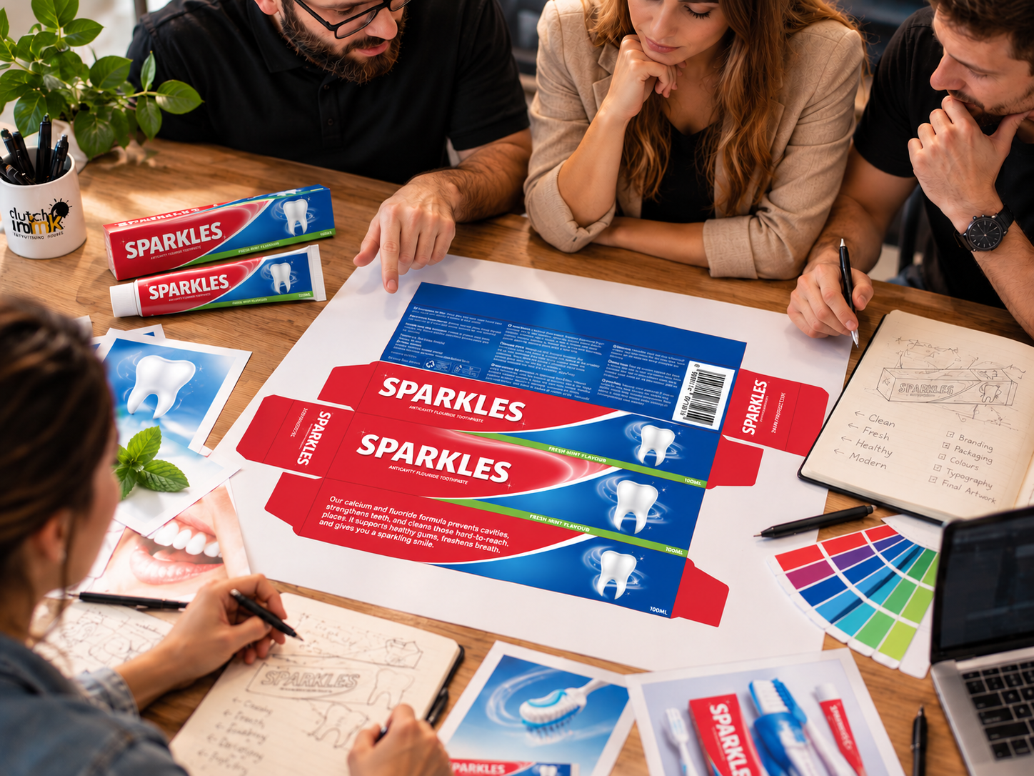
For SPARKLES, Dutch Ink developed the carton artwork around the key elements of the brand identity.
The front-facing design prominently features the SPARKLES wordmark, supported by the product descriptor Anticavity Fluoride Toothpaste.
A sweeping white curve separates the red and blue fields, creating movement across the pack and directing attention towards the illustrated tooth.
The tooth illustration, surrounded by subtle circular effects, reinforces the product category and provides a recognisable visual feature.
A green strip along the lower edge identifies the Fresh Mint Flavour, while the 100 ml quantity is clearly displayed.
Designing Beyond the Front Panel
A packaging project cannot be judged by its front panel alone.
Dutch Ink’s artwork extends across the complete carton layout, incorporating the different information areas required for the product presentation.
The supplied packaging design includes:
- Product branding and flavour identification.
- Directions for use.
- Ingredient information.
- Warnings and precautionary information.
- Product quantity.
- Barcode placement.
- Supplier and contact information.
- Supporting packaging symbols.
The information is arranged across the carton panels, allowing the brand identity to remain prominent while accommodating the practical requirements of the packaging format.
The result is a coordinated packaging design rather than a collection of disconnected graphics.
FMCG Packaging Design: Why Shelf Presence Matters
In a retail environment, products compete for attention within seconds.
Packaging needs to communicate what the product is, who it is for and why a shopper should consider it.
For toothpaste, that communication depends on several visual factors.
1. Immediate Product Recognition
The illustrated tooth, oral care terminology and fresh colour palette help identify SPARKLES as a toothpaste product.
2. Strong Brand Visibility
The large white SPARKLES wordmark creates contrast against the red background, supporting quick recognition.
3. Clear Product Information
The product type, flavour and quantity are positioned to help shoppers understand the offering without unnecessary visual clutter.
4. Consistent Brand Presentation
The visual identity continues across the packaging panels, creating a unified product appearance.
These principles are relevant not only to toothpaste but also to personal care, household goods, food products and other FMCG categories.
From Packaging Artwork to Brand Presentation
One of the important aspects of the SPARKLES project was developing a design that could be presented as a complete consumer product.
The final packaging artwork provides a foundation for product mockups, marketing visuals, promotional material and future brand communication.
By considering the full carton layout alongside the brand identity, Dutch Ink created a cohesive presentation that connects the product name, graphic design and retail packaging.
This approach is central to effective product branding and packaging development: every customer-facing element should contribute to the same brand story.

A Brand Created for the Hypercheck Group
The SPARKLES project illustrates Dutch Ink Advertising House’s approach to building consumer product brands for established businesses introducing new offerings.
Working for the Hypercheck Group, Dutch Ink developed the SPARKLES toothpaste identity and carton packaging artwork, bringing together brand naming presentation, typography, colour, product communication and packaging layout.
The completed design establishes a recognisable visual foundation for the SPARKLES brand.
Rather than relying on excessive decoration, the packaging uses familiar oral care cues combined with bold branding to create a practical and distinctive product presentation.
What This Project Demonstrates About Packaging Design in South Africa
Successful packaging development requires an understanding of both creative design and commercial application.
For businesses launching new consumer products, the packaging is often the first physical interaction a customer has with the brand.
The SPARKLES case study highlights the importance of:
- Developing a recognisable identity from the outset.
- Designing for the product category and target retail environment.
- Balancing shelf impact with practical information requirements.
- Maintaining consistency across every packaging panel.
- Creating artwork that supports future marketing applications.
A product’s packaging should not be treated as an afterthought. It is a fundamental part of how the brand communicates with consumers.
Looking to Develop Your Own FMCG Brand?
Whether you are introducing a new toothpaste, personal care product, food range or household consumer brand, the right visual identity and packaging design can make a meaningful difference to how your product is presented.
Dutch Ink Advertising House provides creative services across brand identity development, graphic design, packaging design and marketing communication for businesses in Durban, KwaZulu-Natal and across South Africa.
From establishing a new product identity to developing the packaging artwork that brings it to life, we help businesses create brands with a clear, confident presence.
Have a product idea that needs a brand?
Explore our Branding & Design Services or contact Dutch Ink Advertising House to discuss your next product development project.
Dutch Ink Advertising House — Real Marketing. Real Results.