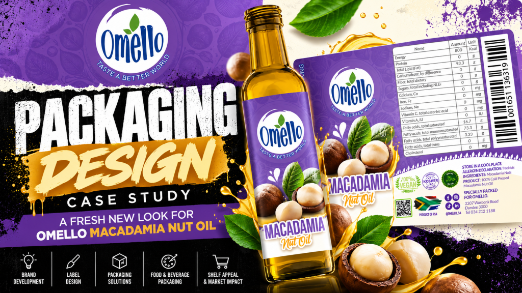
A packaging design case study by Dutch Ink Advertising House
Packaging That Makes a Product Stand Out
In a competitive retail environment, packaging is more than a protective covering. It is a brand’s first opportunity to communicate quality, establish recognition and influence purchasing decisions.
For Omello Macadamia Nut Oil, Dutch Ink Advertising House developed a distinctive packaging design that combines strong brand recognition, natural product imagery and confident typography.
The objective was to create a visually appealing product presentation that would capture attention, communicate the contents clearly and give Omello a memorable presence in the food and speciality oil category.
This project demonstrates how strategic packaging design in South Africa can transform a product’s presentation into a valuable branding and marketing asset.
The Design Challenge: Balancing Brand Identity and Product Appeal
Macadamia nut oil is a speciality product with a unique ingredient story. Its packaging needs to communicate what the product is while giving consumers a reason to notice it.
For Omello, the design challenge centred on three important considerations:
- Brand recognition: Ensuring the Omello name remained prominent and instantly identifiable.
- Product communication: Clearly presenting Macadamia Nut Oil through typography and ingredient imagery.
- Shelf appeal: Creating a confident visual identity capable of standing out among competing bottled oils.
Rather than relying on conventional green and earthy packaging colours, the design uses a bold purple foundation to create a recognisable and differentiated appearance.
Our Packaging Design Approach
1. A Bold, Recognisable Colour Palette
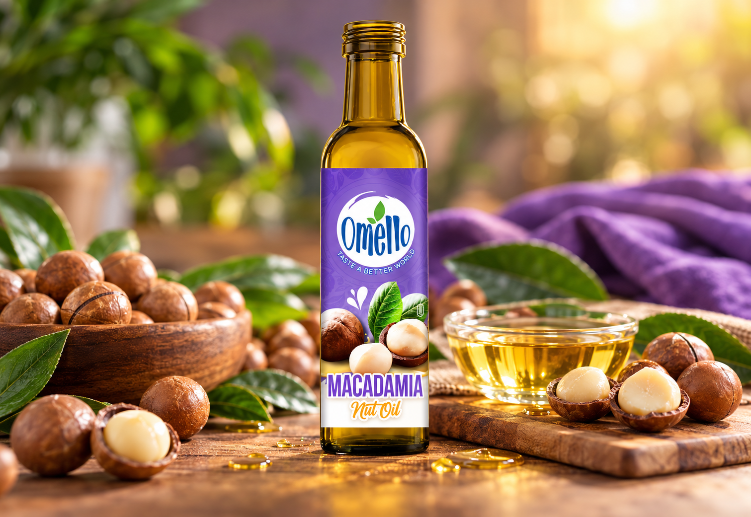
Purple forms the visual foundation of the Omello Macadamia Nut Oil label.
The rich purple background introduces a distinctive personality, while subtle botanical patterns add depth without overwhelming the composition.
White provides contrast for the Omello logo, and warm golden accents complement the natural colour of the oil inside the glass bottle.
Together, these elements create a design that feels expressive, polished and commercially focused.
2. Strong Brand Identity and Visual Hierarchy
The Omello logo takes a prominent position in the upper section of the label, framed by a white circular device that separates it from the purple background.
The brand’s tagline, Taste a Better World, reinforces its identity and creates continuity between the product and the wider Omello brand.
The product name, MACADAMIA Nut Oil, is positioned towards the bottom of the label in large, highly visible typography.
This creates a clear visual hierarchy: the consumer sees the brand, recognises the ingredient and understands the product category.
3. Natural Product Imagery That Tells the Story
One of the most important elements of effective food packaging design is making the product immediately recognisable.
For Omello, detailed macadamia imagery plays a central role.
Whole nuts, opened shells and green leaves create a direct visual connection to the product’s primary ingredient.
The photography-inspired imagery introduces texture, freshness and natural character, providing a compelling contrast against the purple background.
This approach allows the packaging to communicate the ingredient visually, reducing reliance on excessive descriptive copy.
4. Designing for the Bottle, Not Just the Label
Successful bottle label design must consider the shape, proportions and physical presentation of the packaging.
The Omello design uses a tall, vertical label composition that complements the slender glass bottle.
The transparent bottle allows the golden colour of the oil to remain visible above the label, creating an additional visual element that supports the overall design.
The result is a balanced product presentation where the bottle, oil colour, label artwork and brand identity work together.
The Final Packaging Design
The resulting Omello Macadamia Nut Oil packaging combines distinctive colour, natural imagery and a clear product message.
The design brings together several important commercial considerations:
- A recognisable Omello brand presence.
- A distinctive purple label that differentiates the product visually.
- Prominent Macadamia Nut Oil identification.
- Ingredient-led imagery that reinforces the product’s natural origin.
- A balanced label composition suited to the bottle’s proportions.
Rather than treating packaging as a standalone graphic, the project illustrates how design decisions can contribute to a consistent, market-facing product identity.

Why Professional Packaging Design Matters for South African Brands
Across South Africa, businesses are competing for attention in supermarkets, speciality food stores, independent retailers and online marketplaces.
Whether launching a new product or refreshing an established range, businesses need packaging that performs both visually and commercially.
Professional packaging design helps brands:
- Establish a consistent and recognisable identity.
- Communicate product information clearly.
- Differentiate products within competitive retail categories.
- Create stronger visual consistency across product ranges.
- Present products professionally across physical and digital sales channels.
For food and beverage brands, packaging also needs to accommodate applicable labelling information and production requirements.
A strong packaging concept therefore combines creativity with practical consideration for the final printed product.

Packaging Design Services in Durban, KwaZulu-Natal and Across South Africa
At Dutch Ink Advertising House, we believe effective packaging design begins with understanding the product, its market and the brand behind it.
From bottle labels and food packaging to retail product branding and promotional packaging, our approach focuses on creating designs that are distinctive, relevant and commercially purposeful.
Based in KwaZulu-Natal, we provide creative branding and packaging design solutions for businesses in Durban, Umhlanga and throughout South Africa.
The Omello Macadamia Nut Oil project is an example of how carefully considered typography, colour, imagery and brand positioning can come together to create a memorable product presentation.
Looking for a Packaging Design Company in South Africa?
Your product deserves packaging that reflects the quality, personality and ambition of your brand.
Whether you’re developing a new food product, introducing a speciality retail range or refreshing your existing packaging, Dutch Ink Advertising House can help create a visual identity designed to stand out.
Let’s give your product the presence it deserves.
Dutch Ink Advertising House
Real Marketing, Real Results.
Explore our branding, graphic design and packaging design services, or contact our team to discuss your next product launch.