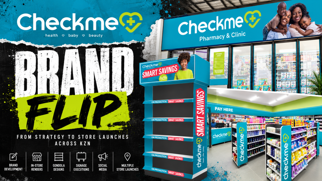
8 Store Flips. 11 Months. One Integrated FMCG & Retail Branding Strategy.
From Brand Development to Retail Execution Across KwaZulu-Natal
A successful retail brand is not built through signage alone. It is developed through a carefully considered combination of brand strategy, consumer communication, FMCG design, shopper marketing, merchandising and consistent retail execution.
For Checkme Pharmacy & Clinic, Dutch Ink Advertising House delivered an extensive creative branding programme spanning eight store transformations across KwaZulu-Natal in just eleven months.
The project brought together brand development, retail design, FMCG promotional artwork, gondola-end displays, point-of-sale marketing, storefront signage, in-store branding and social media campaign development.
Our focus was on building a unified retail identity that could communicate consistently across physical stores, promotional environments and digital channels.
The Checkme project demonstrates how an integrated approach to FMCG branding and retail design in South Africa can connect brand strategy with the practical realities of retail marketing.
The Strategy: Building a Recognisable Retail Brand
The starting point for effective brand development is understanding how customers interact with a business.
In pharmacy retail, shoppers encounter a wide variety of competing brands, product categories, promotions and purchasing decisions.
A retailer’s own brand identity needs to remain recognisable throughout that environment.
For Checkme, the creative strategy centred on establishing a cohesive visual system that could be applied across multiple stores and marketing platforms.
The Checkme identity combines vibrant turquoise, lime-green accents, clean white typography and a distinctive medical heart symbol.
The brand positioning, Health. Baby. Beauty., provides a clear framework for communicating its principal retail categories.
Translating Strategy into Practical Design
The creative direction was developed around five interconnected priorities:
- Brand recognition: Establishing consistent visual elements across every customer touchpoint.
- Retail visibility: Creating impactful signage and branding within busy commercial environments.
- Shopper communication: Making promotions, product categories and retail messaging easier to identify.
- FMCG merchandising: Developing display concepts that connect promotional communication with product presentation.
- Scalability: Applying the same identity across eight different store environments without losing brand consistency.
The objective was not simply to make individual stores look better, but to develop a recognisable and repeatable retail branding system.
FMCG Design: Where Brand Identity Meets the Shopper
Fast-moving consumer goods marketing operates in a highly competitive environment.
Products compete for attention through packaging, promotional pricing, shelf positioning, point-of-sale communication and visual merchandising.
For retailers such as Checkme, FMCG design plays an important role in how product promotions are presented to customers.
Dutch Ink’s creative work connected the Checkme identity with consumer-facing product marketing.

FMCG Promotional Artwork
The Checkme Baby Essentials promotional campaign demonstrates this approach.
The creative combines established consumer brands, product photography, promotional pricing and clear category messaging within a consistent Checkme visual framework.
Strong yellow headline panels introduce the offer, while turquoise pricing devices highlight the promotional values.
The approach creates a clear hierarchy between the category headline, product imagery, price and retailer identity.
These design principles are important in FMCG advertising, where customers often need to recognise a product and understand an offer quickly.

Product-Led Retail Communication
Effective FMCG promotional design needs to balance multiple visual priorities.
The product must remain recognisable. The price must be clear. The promotional message must be immediate. And the retailer’s brand must remain visible.
For Checkme, Dutch Ink developed promotional artwork that brought these elements together while maintaining the established brand colours and typography.
This illustrates our approach to FMCG advertising design, retail promotional graphics and shopper-facing marketing communications.
Gondola-End Design and Shopper Marketing
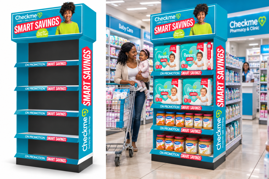
One of the key creative components of the Checkme project was the development of branded gondola-end display concepts.
Gondola ends are important promotional locations within retail stores because they provide dedicated space for featured products and campaigns.
They are also an opportunity to extend the retailer’s visual identity directly into the merchandising environment.
The Smart Savings Retail Campaign
Dutch Ink developed Checkme’s Smart Savings gondola-end creative, combining branded display structures with promotional messaging.
The design incorporates:
- Large-format Smart Savings promotional headers.
- Strong turquoise display branding.
- Contrasting red promotional graphics.
- Branded vertical side panels.
- Consistent shelf-edge promotional strips.
- Space for featured FMCG products.
The design was developed as a three-dimensional retail display concept, helping communicate how the branding would appear within an actual shopping environment.
Designing for the Point of Purchase
Point-of-purchase design requires a different approach from conventional advertising.
A display must communicate effectively within the physical environment, alongside surrounding products, fixtures and competing visual messages.
For the Checkme gondola concept, the creative hierarchy was designed around brand recognition, promotional visibility and practical product presentation.
This is where shopper marketing strategy, point-of-sale design and FMCG merchandising intersect.
Rather than treating gondola branding as decorative artwork, the objective was to create a coordinated retail marketing asset.
Retail Environment Development and In-Store Branding
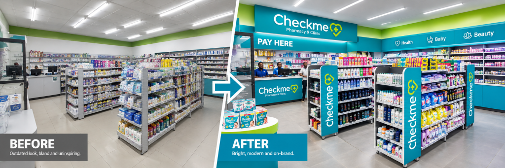
The Checkme transformation extended the brand identity throughout the retail environment.
Dutch Ink’s creative work included shopfront treatments, interior branding, checkout-area graphics, branded gondola panels and promotional display concepts.
Each element formed part of the wider retail identity.

Creating Consistency Throughout the Store
A customer should be able to recognise a retailer’s identity whether viewing the storefront, approaching the checkout counter or encountering a promotional display.
For Checkme, turquoise and lime-green branding provided that consistent visual connection.
The store environment incorporated:
- Storefront branding: Large-format Checkme signage, family-focused imagery and Pharmacy & Clinic identification.
- Interior branding: Coordinated colour treatments and branded retail fixtures.
- Checkout presentation: Customer