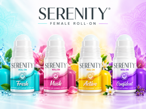
A packaging, product visualisation and campaign case study by Dutch Ink Advertising House.
Deodorant Packaging Design Built as a Brand System
Creating effective deodorant packaging is about more than making a product look good on shelf. In the highly competitive personal care and FMCG market, packaging needs to communicate the brand, differentiate variants, reinforce product benefits and remain consistent across an expanding product range.
For the Serenity Female Roll-On range, Dutch Ink developed a fresh packaging direction and visual rollout designed to bring four distinctive deodorant variants together as one recognisable product family.
The result is a colourful, feminine and highly adaptable roll-on deodorant packaging system built around strong variant recognition, consistent branding and clear consumer communication.
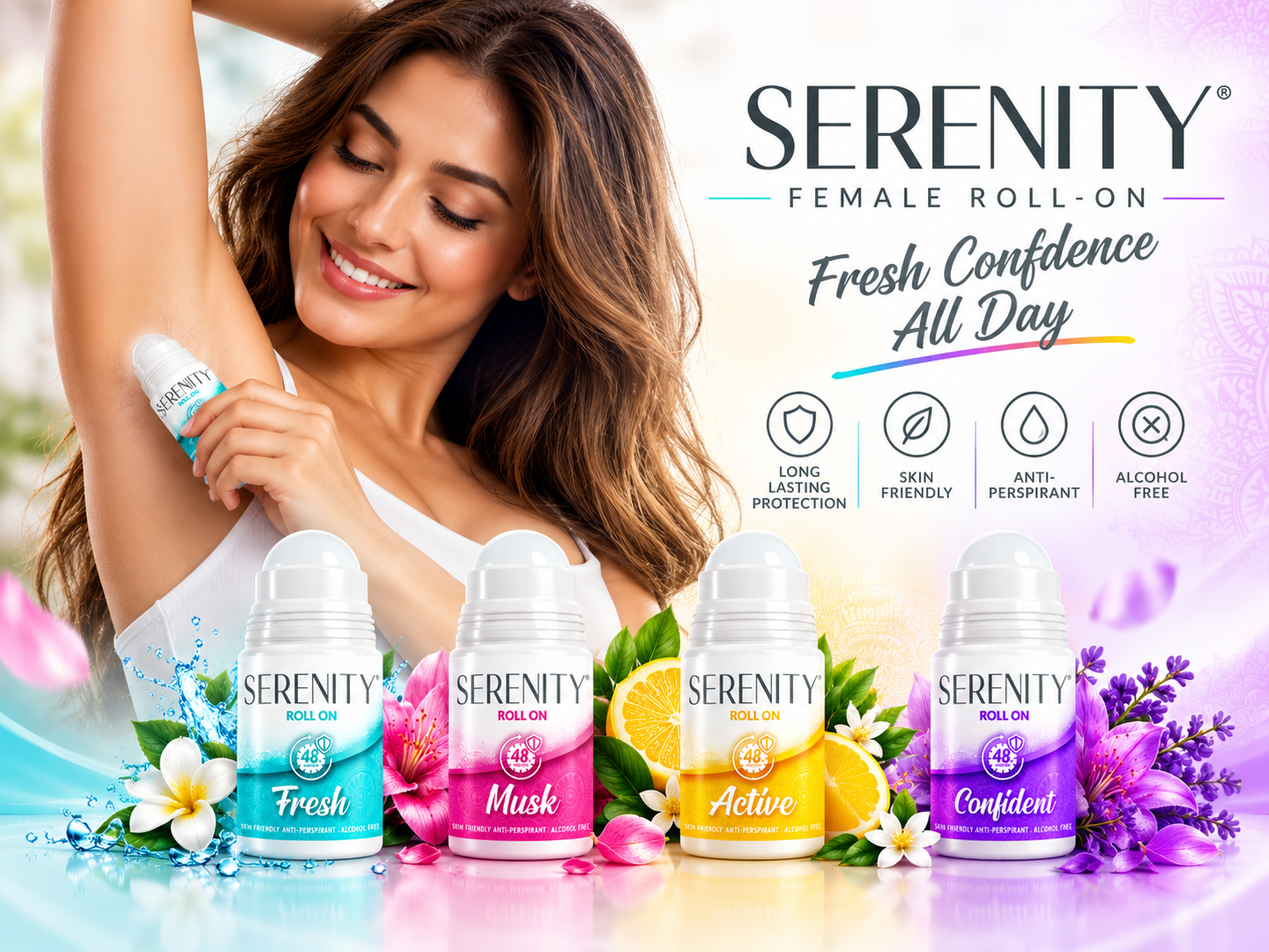
Fresh, Musk, Active and Confident presented as one coordinated product family.
The Challenge: One Brand Across Multiple Variants
Personal care shelves are visually competitive. A deodorant brand has only a few seconds to communicate what the product is, who it is for and why someone should choose it.
The Serenity range needed to accommodate four distinct variants: Fresh in aqua and turquoise; Musk in vibrant pink; Active in energetic yellow and citrus-inspired tones; and Confident in rich purple and violet.
Each fragrance needed its own personality without looking like a separate brand. The challenge was therefore to develop a scalable FMCG packaging design system that could create strong differentiation between fragrances while maintaining a consistent Serenity identity across the complete female roll-on range.
The Packaging Design Approach
The design system combines clean white space with energetic colour, curved graphic elements and subtle decorative patterns. A consistent Serenity brand area anchors every pack, while the lower portion of each label introduces the individual fragrance identity.
Across the range, a consistent hierarchy was established for the brand name, Roll On descriptor, fragrance name, 48-hour protection message, product benefits, ingredients and barcode information. This consistency becomes particularly important when an FMCG range expands into additional fragrances, pack sizes or related personal care products.

Fresh: a cool aqua visual language communicating cleanliness, freshness and all-day protection.
Four Variants. One Recognisable Product Family.
Colour plays a major role in helping consumers navigate a multi-variant range. Rather than simply changing one colour on the same label, each Serenity variant was given a visual personality while retaining the same fundamental packaging architecture.
Variant Differentiation
Fresh uses cooling aqua tones to communicate cleanliness and freshness. Musk introduces warmer pink and magenta tones for a softer fragrance-led personality. Active uses bright yellow and citrus-inspired energy to suggest movement and an active lifestyle. Confident uses rich purple tones to create a stronger, more expressive identity.
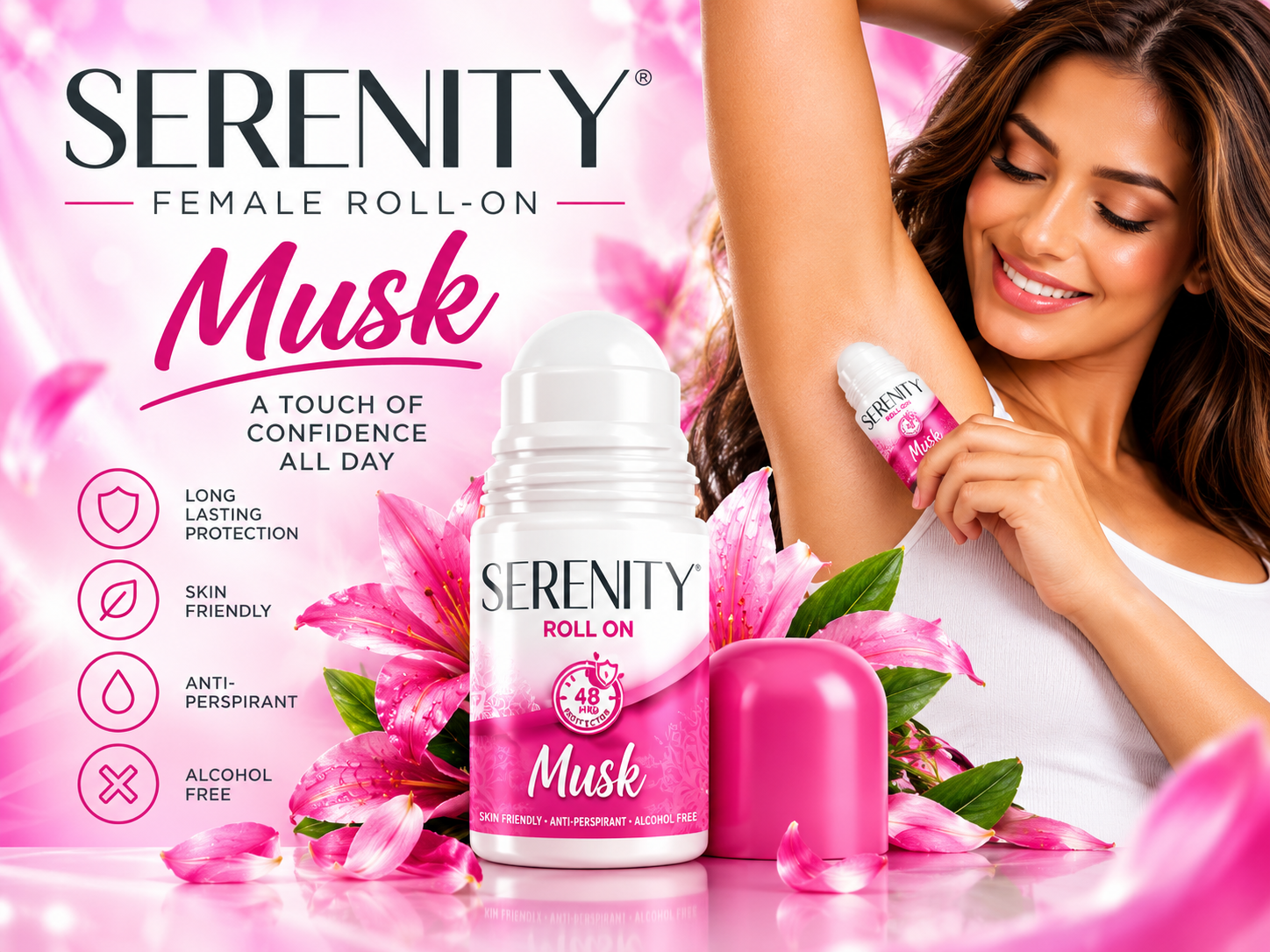
Musk
Warm pink and magenta tones create a softer, fragrance-led personality.

Active
Bright yellow and citrus-inspired energy suggests movement and an active lifestyle.
Placed together, the four variants create a coordinated deodorant product range with strong shelf presence and immediate visual navigation.
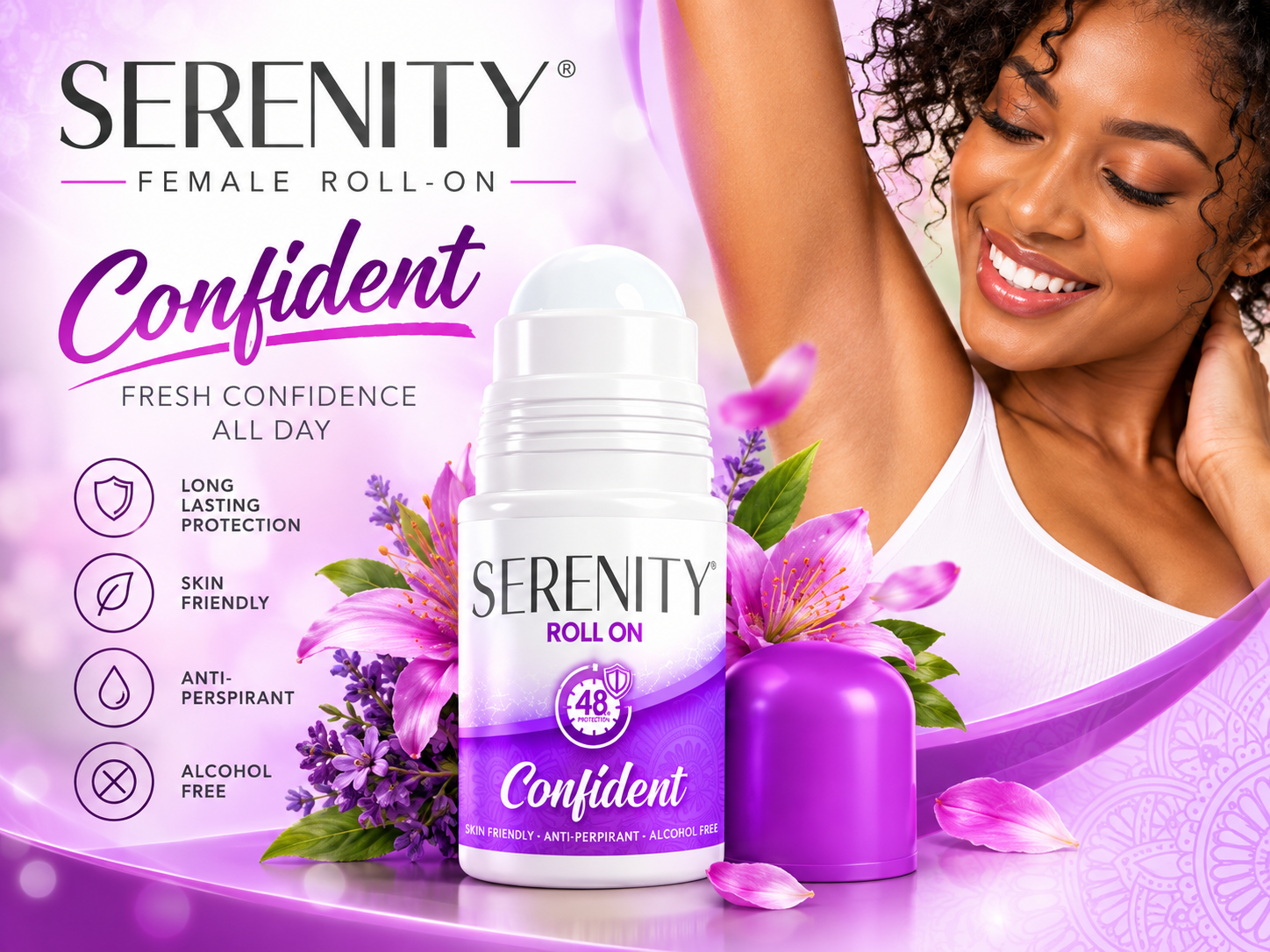
Confident: a richer purple campaign world that strengthens personality while remaining unmistakably Serenity.
From Flat Packaging Artwork to Real-World Product Visualisation
Packaging design should never be evaluated only as flat artwork. As part of the project, the Serenity labels were developed into realistic roll-on deodorant packaging mockups, allowing the brand to see how each design would behave on the physical container.
These product visualisations help evaluate label scale, colour balance, brand visibility and variant differentiation before production. They also create useful marketing assets that can extend beyond packaging approval into presentations, sales material, retailer communication, websites, social media and digital advertising.
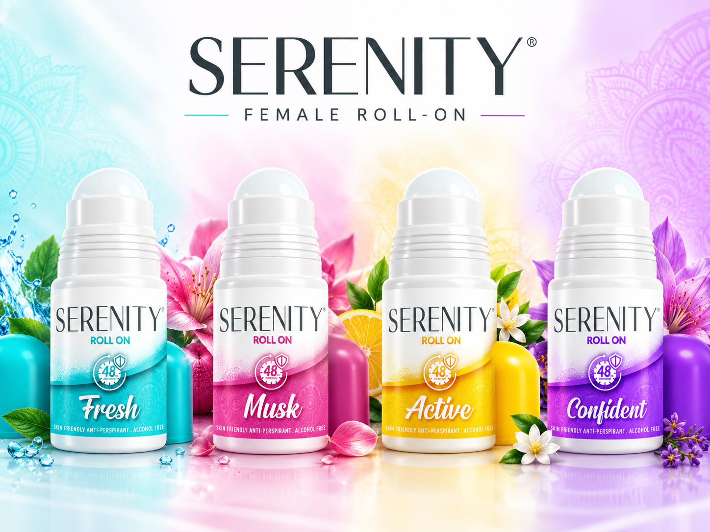
The complete four-variant roll-on range visualised as a cohesive retail-ready family.
Packaging Designed for Marketing, Not Just the Shelf
The visual identity was extended beyond the physical product into a broader campaign system. Individual campaign treatments were developed around Fresh, Musk, Active and Confident, combining product imagery, lifestyle photography, fragrance-inspired visual cues and key product benefits.

The packaging system translated into consumer-facing digital and social advertising.
Why Consistent FMCG Packaging Matters
Successful FMCG packaging design has to balance creativity with commercial practicality. Consumers need to recognise the brand quickly. Retailers need clearly differentiated products and SKUs. Marketing teams need assets that translate effectively into campaigns. Production teams need artwork that can be implemented consistently.
For Serenity, the objective was not simply to create four attractive labels. It was to create a visual framework capable of supporting the brand as a coherent range.
Personal Care Packaging Design in South Africa
Dutch Ink Advertising House is a Durban-based creative agency working with brands that need commercially focused packaging design, FMCG branding, product visualisation and campaign creative.
Our approach connects packaging with the broader brand experience – from the first concept and product range architecture through to mockups, campaign visuals, digital advertising and supporting marketing collateral.
For companies developing or refreshing products within the deodorant, antiperspirant, skincare, body care, beauty, cosmetics, toiletries, hygiene and personal care sectors, this creates one visual system that can work from packaging through to market launch.
PLANNING A NEW PERSONAL CARE OR FMCG PRODUCT RANGE?
Talk to Dutch Ink about packaging design, product visualisation and campaign creative built to work together from shelf to screen.