An FMCG packaging design and branding case study by Dutch Ink Advertising House
Creating Packaging That Makes a Baby Care Brand Stand Out
In South Africa’s competitive fast-moving consumer goods (FMCG) market, effective packaging design plays a critical role in how consumers discover, recognise and connect with products.
For baby care products, packaging needs to achieve something particularly important: communicate gentleness, establish a reassuring brand personality and stand out in a retail environment filled with competing products.
At Dutch Ink Advertising House, our approach to FMCG packaging design combines creative thinking, brand identity development and commercially focused visual communication.
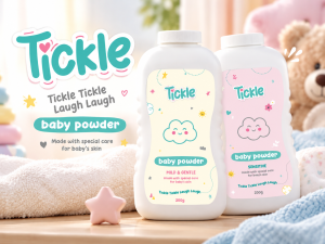
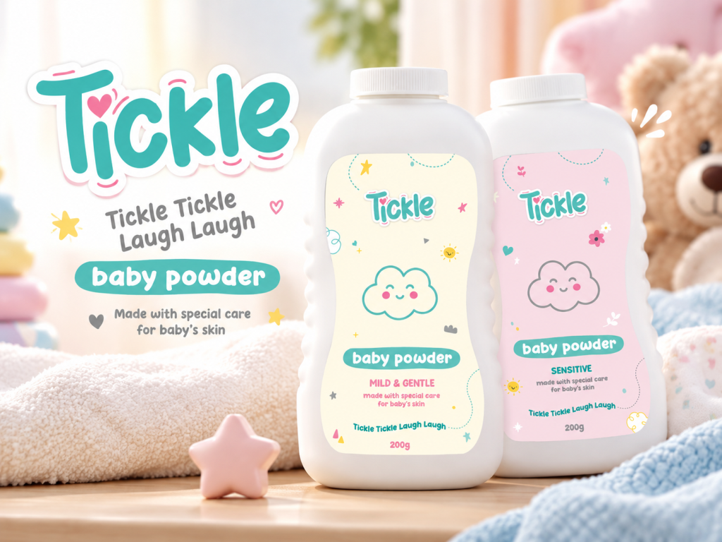
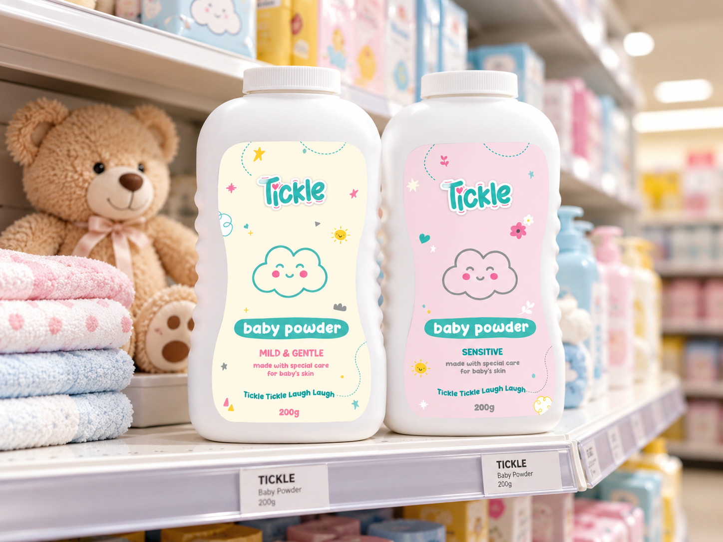
Our packaging design work for Tickle Baby Powder demonstrates how a playful visual identity, carefully selected colours and distinctive product graphics can create an engaging brand presence.
The project centres on two baby powder variants:
- Tickle Baby Powder – Mild & Gentle
- Tickle Baby Powder – Sensitive
Both products share a recognisable brand identity while using individual colour treatments to help consumers distinguish between the variants.
The result is a cohesive packaging concept that brings warmth, personality and consistency to the Tickle baby care range.
The Packaging Design Challenge: Building Recognition in a Competitive FMCG Category
Baby powder is a familiar product category, but familiarity creates its own branding challenges.
Consumers are exposed to numerous baby care products competing for attention through colour, packaging shape, messaging and brand recognition.
For Tickle Baby Powder, the creative challenge was to establish a distinctive visual identity that would feel appropriate for the baby care market without becoming generic.
Our design approach focused on four important objectives.
1. Establishing a Recognisable Brand Identity
The Tickle wordmark needed to become the central visual element of the packaging.
Its rounded, playful lettering creates an approachable personality, while the turquoise and pink colour combination helps establish a consistent identity across the product range.
2. Communicating a Gentle Brand Personality
Baby care packaging requires a considered visual language.
Soft colours, friendly illustrations and uncluttered product messaging help communicate a sense of care and comfort.
The Tickle packaging uses these visual cues to create a welcoming product presentation.
3. Creating Clear Product Differentiation
The Mild & Gentle and Sensitive variants needed to look like members of the same product family while remaining easy to distinguish.
This was achieved through complementary pastel packaging colours and clearly presented variant descriptions.
4. Developing Strong Retail Shelf Appeal
Effective FMCG packaging needs to communicate quickly.
Consumers should be able to identify the brand, recognise the product category and distinguish between variants without studying the packaging.
The Tickle designs use a clear visual hierarchy to support this process.

The Creative Solution: A Playful Baby Powder Packaging Identity
The Tickle Baby Powder packaging combines soft pastel colours, cheerful illustrations and distinctive typography.
Rather than relying on complicated graphics, the design establishes its personality through a small number of consistent visual elements.
A Colour Palette Designed for the Baby Care Market
Colour plays an important role in FMCG packaging design.
For Tickle, we used a combination of turquoise, pink, cream and subtle accent colours to create a light, friendly visual identity.
The Mild & Gentle variant features a soft cream background, while the Sensitive variant uses a gentle pastel pink.
These colours provide immediate product differentiation without compromising the overall brand identity.
A Friendly Character That Builds Recognition
One of the defining elements of the Tickle packaging is the smiling cloud illustration.
Its rounded form and simple facial expression create a playful visual connection with the brand.
Supported by small hearts, stars, flowers and other decorative elements, the illustration introduces personality without overpowering the product information.
This character-led approach also creates opportunities for consistent brand storytelling across future packaging, advertising and digital marketing applications.
Typography That Balances Personality and Readability
Typography is central to successful packaging design.
The Tickle wordmark uses soft, rounded lettering to establish a friendly identity, while the supporting product information remains clear and structured.
Important information, including the product category, variant and 200g pack size, is positioned within an organised visual hierarchy.
This balance between expressive branding and practical communication is essential when designing packaging for retail environments.
FMCG Packaging Design: Why Shelf Appeal Matters
Retail packaging is often the first physical interaction between a consumer and a brand.
In a busy supermarket or pharmacy environment, products must compete for attention within seconds.
Successful packaging design therefore needs to perform several functions simultaneously:
- Brand recognition: Helping consumers identify the product and remember its name.
- Category communication: Making it immediately clear what the product is.
- Product differentiation: Distinguishing variants within the same range.
- Visual consistency: Building familiarity across multiple products.
- Shelf presence: Creating a distinctive appearance alongside competing brands.
For Tickle Baby Powder, the combination of pastel colours, consistent graphics and a prominent wordmark supports these objectives.
The packaging demonstrates how a cohesive FMCG brand identity can strengthen product presentation without relying on excessive visual complexity.
Extending Packaging Design into Digital and Social Media Marketing
A well-designed FMCG brand should not exist only on its packaging.
Its visual identity should provide a foundation for communication across multiple marketing channels.
The Tickle design language is particularly suited to creative digital applications because of its recognisable colours, playful typography and character illustrations.
Social Media Creative and Product Advertising
The Tickle visual identity can be extended into social media content featuring product photography, lifestyle imagery, promotional graphics and campaign messaging.
Consistent use of the brand’s colours, typography and illustrations helps connect digital advertising with the physical product consumers encounter in stores.
This creates a more cohesive customer experience between online brand discovery and retail shopping.
Retail Marketing and Point-of-Sale Design
The same visual elements can be adapted for retail marketing materials such as shelf displays, product posters, promotional signage and in-store campaign graphics.
A consistent visual identity across packaging and point-of-sale communication can make the product range easier to recognise.
Digital Advertising and PPC Opportunities
For FMCG brands looking to increase product awareness, paid advertising can complement packaging design and organic marketing activity.
Platforms such as Meta Ads and Google Ads can support targeted brand awareness campaigns, retailer promotions and product discovery, depending on the brand’s distribution and marketing objectives.
Importantly, effective paid advertising depends on more than media placement.
The product imagery, creative message, brand recognition and landing-page experience all influence how consumers respond.
The Tickle identity provides a creative foundation for these applications. The digital and retail scenes presented in this case study illustrate potential brand extensions rather than verified live campaigns.

Why Consistent Brand Management Matters for FMCG Products
Packaging design is one component of a broader brand management strategy.
As an FMCG brand grows, maintaining consistency across products, advertising materials and retail touchpoints becomes increasingly important.
Without clear brand guidelines, product variants and marketing materials can gradually develop inconsistent appearances.
This weakens recognition and makes it more difficult to establish a cohesive market presence.
At Dutch Ink Advertising House, we approach branding as a connected system.
That means considering how an identity functions across:
- Product packaging and label design
- Brand identity and visual guidelines
- Retail and point-of-sale marketing
- Social media creative
- Digital advertising and PPC
- Website design and product presentation
- Promotional campaigns and marketing collateral
For Tickle Baby Powder, the shared design elements provide a foundation for consistent future brand applications.
Packaging Design for South African FMCG Brands
South Africa’s FMCG market includes established national manufacturers, growing independent brands and emerging businesses introducing new products into competitive retail categories.
Regardless of business size, professionally designed packaging helps communicate a product’s identity and positioning.
For baby care brands, this requires particular attention to visual clarity, consumer expectations and responsible product communication.
Packaging should also be reviewed for applicable product labelling requirements before commercial production. Creative design must work alongside accurate product information and any necessary regulatory or safety disclosures.
Dutch Ink Advertising House provides creative branding and packaging design services from Durban, KwaZulu-Natal, working with businesses seeking distinctive and commercially appropriate brand identities.
Our work extends beyond individual packaging executions to consider how the brand will appear across its wider marketing environment.

The Tickle Baby Powder Packaging Design Outcome
The Tickle Baby Powder project demonstrates the value of creating a unified visual identity across multiple product variants.
The designs establish:
A recognisable brand presence: The Tickle wordmark and smiling cloud illustration create a consistent visual signature.
Clear product differentiation: Complementary pastel colours distinguish the Mild & Gentle and Sensitive variants.
A cohesive packaging system: Typography, illustrations and layout remain consistent across the range.
A flexible creative foundation: The identity can be adapted for retail displays, digital advertising and social media content.
While commercial performance data is not presented as part of this case study, the creative work illustrates how thoughtful FMCG packaging design can support product recognition and a more unified brand presentation.
Looking for an FMCG Packaging Design Agency in South Africa?
Whether you’re introducing a new baby care product, developing a cosmetics range, refreshing food packaging or building an entirely new FMCG brand, professional packaging design can play an important role in how your business presents itself.
At Dutch Ink Advertising House, we combine creative design, brand development and marketing expertise to help businesses establish distinctive visual identities.
Our services include:
- FMCG packaging and label design
- Product branding and brand identity development
- Corporate identity and brand management
- Retail advertising and point-of-sale design
- Social media marketing and creative content
- SEO and digital marketing
- Google Ads and Meta PPC advertising
- WordPress website design and development
From initial packaging concepts through to coordinated digital marketing, our objective is to create branding that works across the environments where customers discover and engage with your business.
Need packaging design that gives your product a distinctive identity?
Visit Dutch Ink Advertising House to explore our creative branding, packaging design and digital marketing services.
Dutch Ink Advertising House — Real Marketing, Real Results.