Standing Out in FMCG
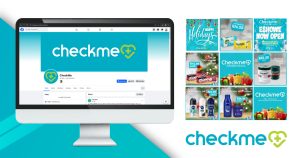
Check Me is a health and beauty-focused FMCG retailer. When the brand partnered with Dutch Ink, the mission was to create a sharper, more memorable presence across physical and digital spaces. From defining Check Me’s visual identity to building its own product lines—like Tickle and Sparkle—Dutch Ink delivered standout creative work with clarity, style, and intent.
The Vision: Bold and Better
Dutch Ink approached Check Me with a focus on simplicity, consistency, and strong shelf and screen impact. The goal was to craft a confident retail identity supported by vibrant, original sub-brands. With visual design and social media working hand-in-hand, Dutch Ink helped position Check Me to resonate with modern consumers and stand tall among its FMCG competitors.
Retail Identity That Pops
The Check Me brand identity centers around a heart-shaped logo with a plus sign, evoking wellness, care, and community. A turquoise-forward color palette communicates freshness and approachability—perfect for a retailer serving families and individuals focused on personal care.
The clean typography and structured design system were applied across digital touchpoints and store visuals, ensuring consistency from one customer interaction to the next. Dutch Ink’s approach ensured that the brand’s presentation felt friendly, accessible, and professional.
The Challenge: Competing with Household Names
Retailers like Clicks, Dis-Chem, and Pick n Pay have built long-standing recognition in South Africa’s FMCG market. Dutch Ink focused on building a Check Me identity that felt equally dependable but brought its own modern edge. With bold design and clear messaging, the result was a brand presence that didn’t feel “new”—it felt established and confident.
Shoppers noticed. Many compared the brand look and feel to larger retail players, a reflection of the deliberate care in every visual decision.
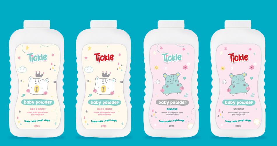
Developing the Sub‑Brands: Tickle & Sparkle
As Check Me expanded its offerings, Dutch Ink was brought in to develop the creative identity, artwork, and packaging for new, in-house product lines:
Tickle (Baby Care)
With items like diapers and powders, Tickle needed to feel gentle, safe, and joyful. Dutch Ink built the look using soft colors, playful graphic cues, and clean layouts to speak to parents and caregivers while maintaining product clarity and shelf presence.
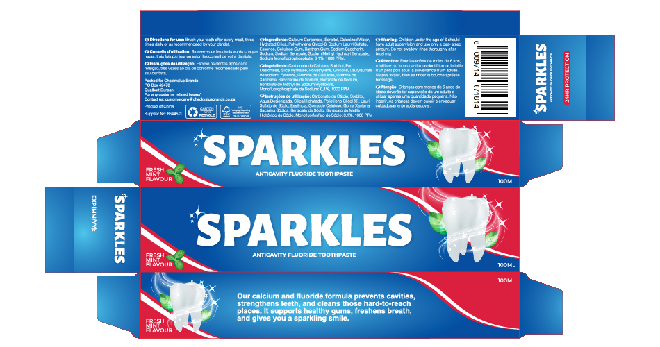
Sparkle (Toothpaste)
Sparkle called for a bright, clean aesthetic that emphasized freshness. Dutch Ink created vibrant packaging using strong contrast, balanced white space, and sleek typography—making it pop on the shelf and appeal across age groups.
Each sub-brand had a distinct visual tone, but both tied back to the Check Me brand system. The result: recognizable, consumer-friendly products that looked at home in any trusted retail space.
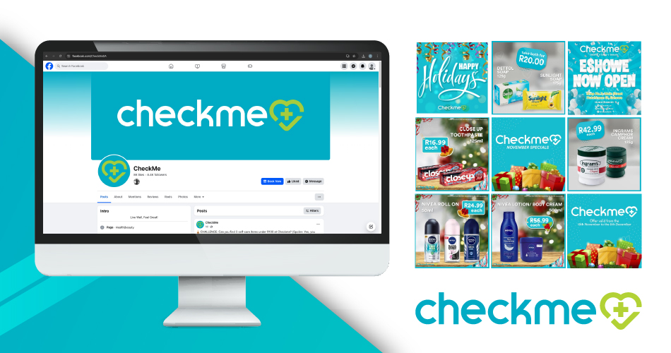
Social Media Content & Campaigns
Dutch Ink also took the reins on Check Me’s social presence, running creative across Facebook, Instagram, and TikTok. Content wasn’t just posted—it was planned, aligned with brand goals, and executed with purpose.
Monthly campaigns included:
Static Posts: Product features, service highlights, and helpful tips.
Animated Graphics: Eye-catching short-form visuals for high engagement.
Thematic Rollouts: Seasonal, lifestyle, and product-based storylines across all platforms.
Tickle and Sparkle were featured naturally within content calendars, supported by visually consistent assets and messaging that echoed their packaging tone.
The brand’s voice was always warm, practical, and community-focused—designed to both inform and connect.
Audience Response
Across social and in-store, customers responded positively. Dutch Ink’s design system helped Check Me feel “on par with the big names,” and users often assumed the product lines were part of larger national brands. That level of consumer confidence is the clearest sign that the creative hit the mark.
Behind the Scenes
Every campaign and package design started with a conversation. Sketches, storyboards, design trials, internal reviews—nothing was left to chance. The Dutch Ink team approached each element with a blend of creativity and planning that kept the brand’s energy high but the execution seamless.
From layout precision to motion graphics and packaging labels, each asset was designed to meet professional retail standards while expressing personality and clarity.
A Unified Brand Experience
From refining Check Me’s store identity to building out its signature in-house brands, Dutch Ink created a full-spectrum brand experience that felt polished, familiar, and fresh. Whether a customer saw the brand on social or walked into a store, the messaging and visual presence felt consistent and strong.
Check Me now holds its own among major FMCG names—with a bold heart icon, a clean and vibrant identity, and product lines that capture both trust and attention.